Answer Lab: A Review of The Websites of UX Companies
Executive Summary
- Companies offering UX consulting and other services should have very usable and effective websites.
- We review them to see how they stack up.

Introduction
UX companies should have terrific websites. In this case, we review the website of Answer Lab.
Our References for This Article
See this link if you want to see our references for this article and other related Brightwork articles at this link.
Main Entry
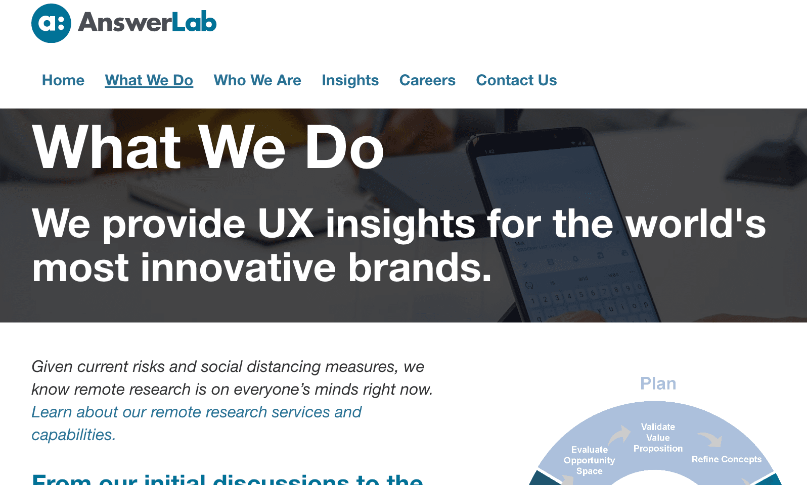
The first page of Answer Lab looks good. At first, it seems a bit plain, but this is a benefit as one uses the website, and other areas of the website make the more plain surrounding design work.
The UX is to scroll to see more and more of what Answer Lab does.
The Menu
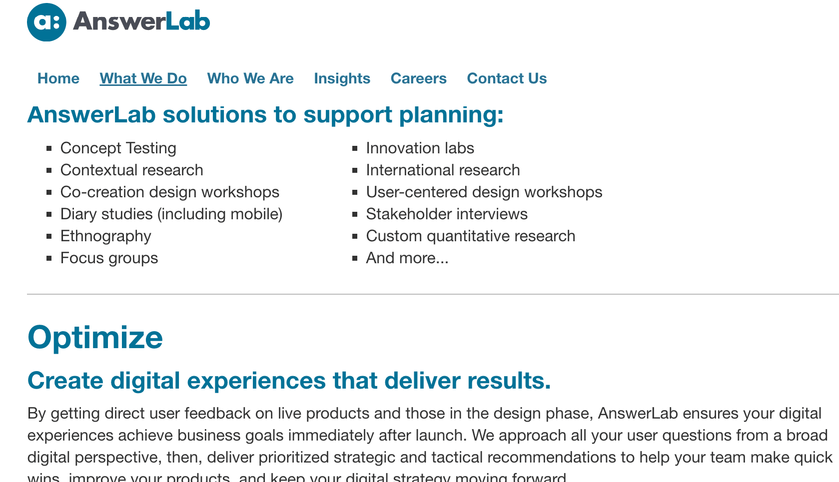
The text is direct and well written. Most UX companies use tiles for the offering sections, but these short bullet points work very well and allow the user to find out what Answer Lab does efficiently.
What Answer Lab Does
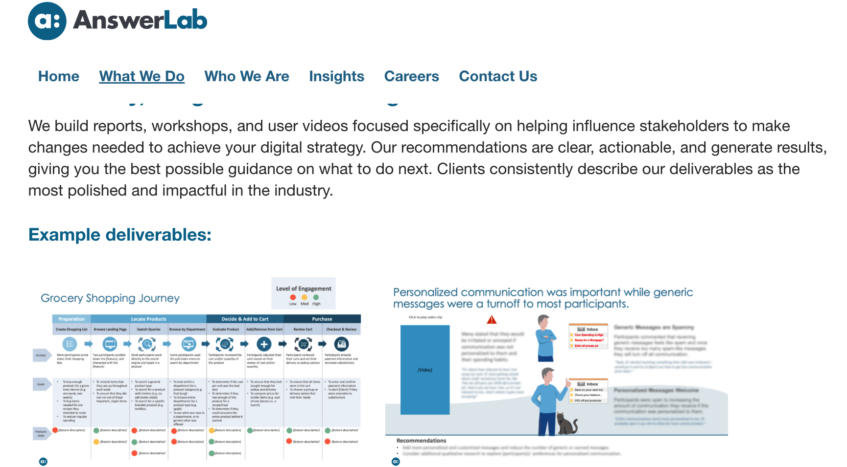
Answer Lab does a good job laying out its approach, and one can tell they have pride and confidence in this approach. Credibility is beginning to build the more I read the website content.
The Portfolio Case Studies

These tiles are ok, but they are crowded and don’t have to be. Without white space between them, it makes it appear as if they are one giant block, which I found to be a disinclination to select them. But they were functional.
Portfolio Items
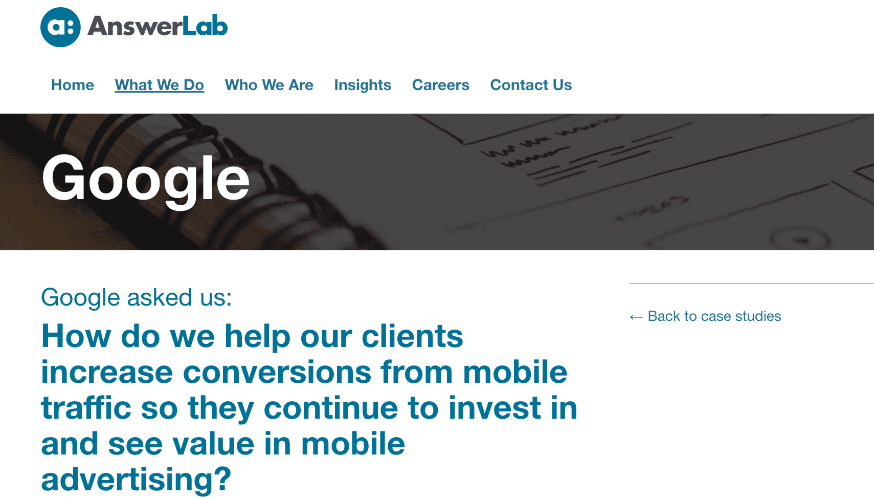
This is great to have Google as a case study. The explanation of what Answer Lab did for Google made sense.
These are some great companies to have in one’s portfolio.
People
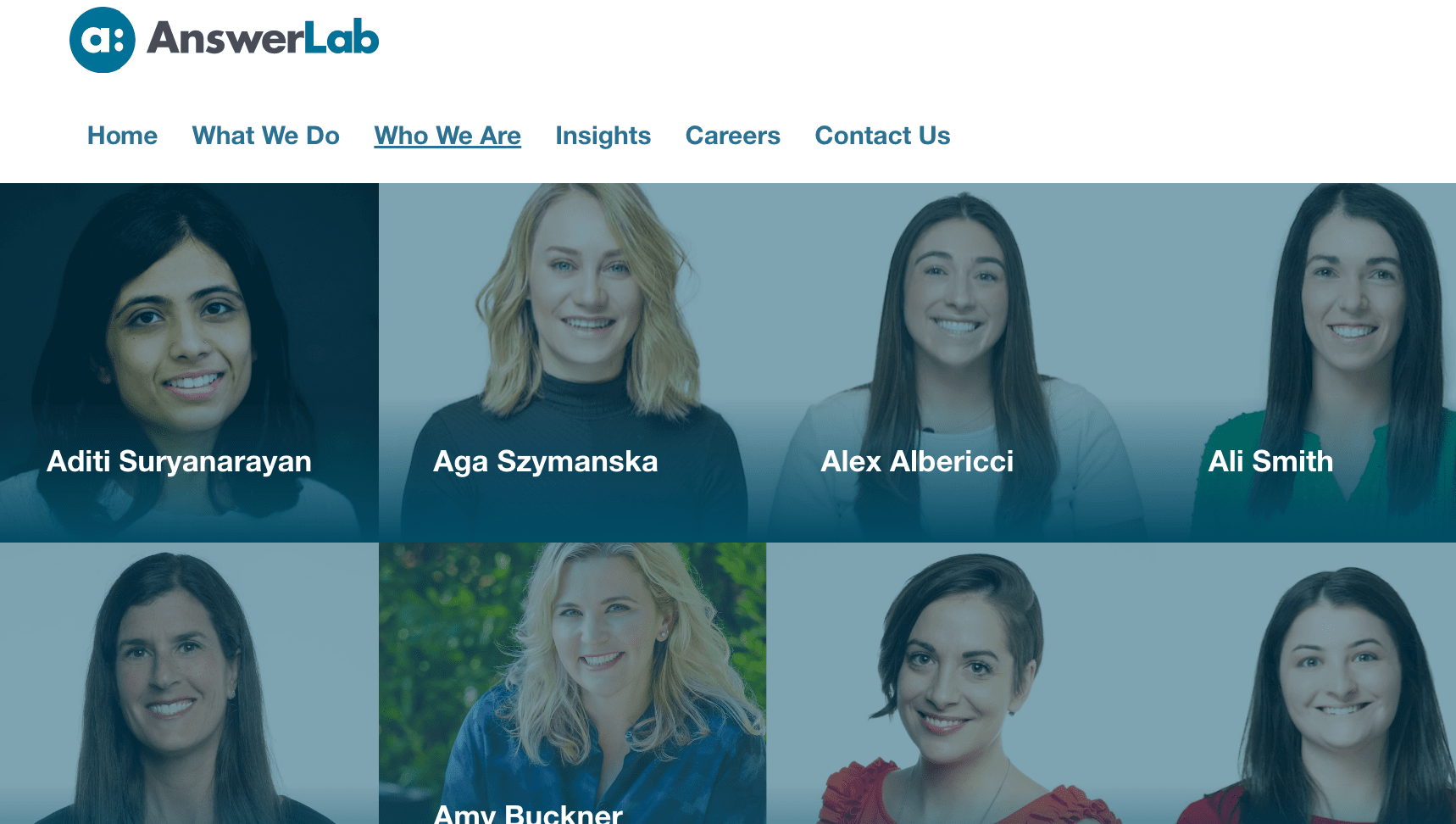
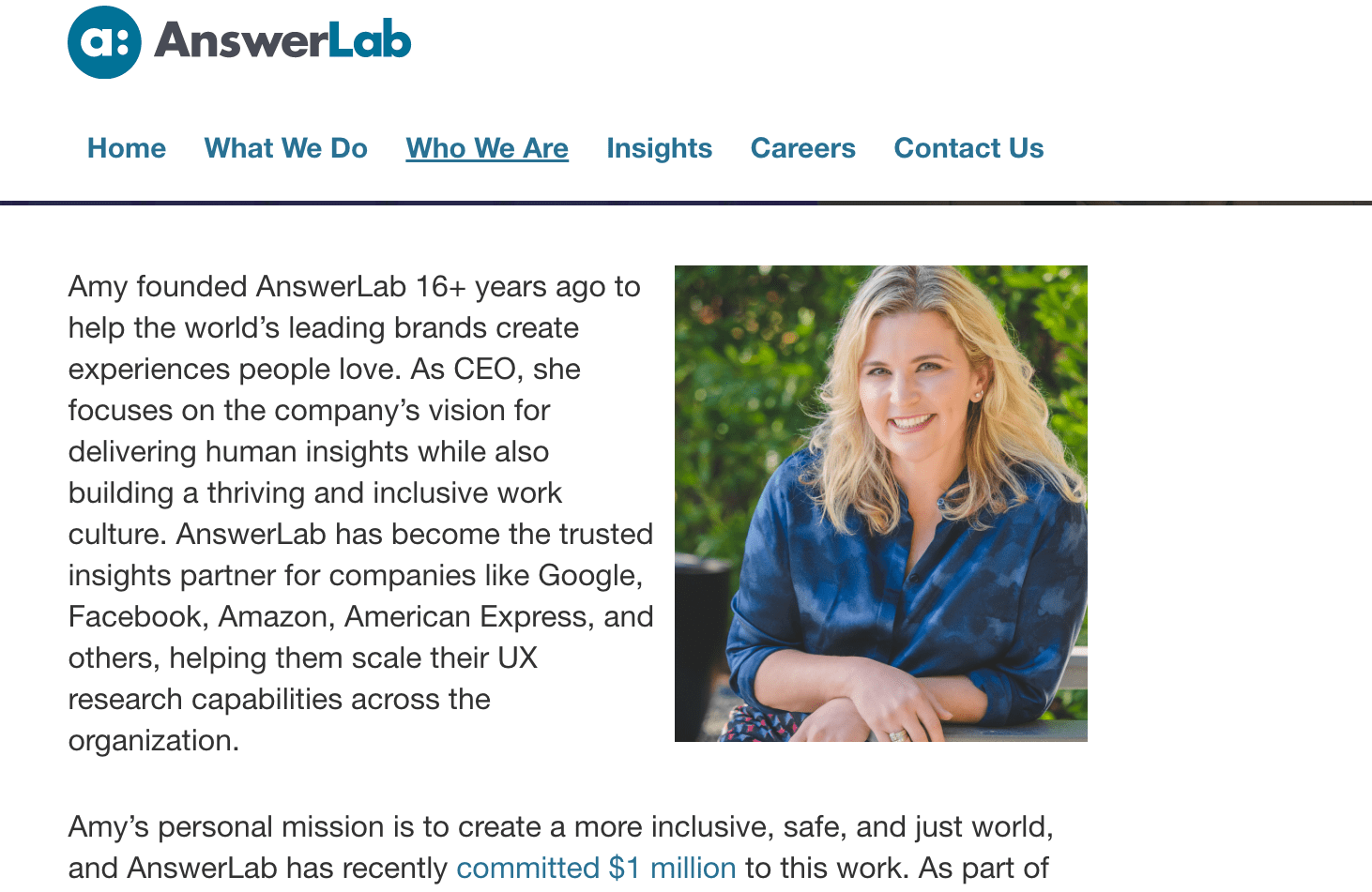
Answer Lab does a good job of showcasing its people. The images are not overly formal and stiff as with many websites, but personable. The text on each member is interesting to read, or most of them is that I checked.
The profiles of the people at Answer Lab are short, effective, and to the point.
The Blog
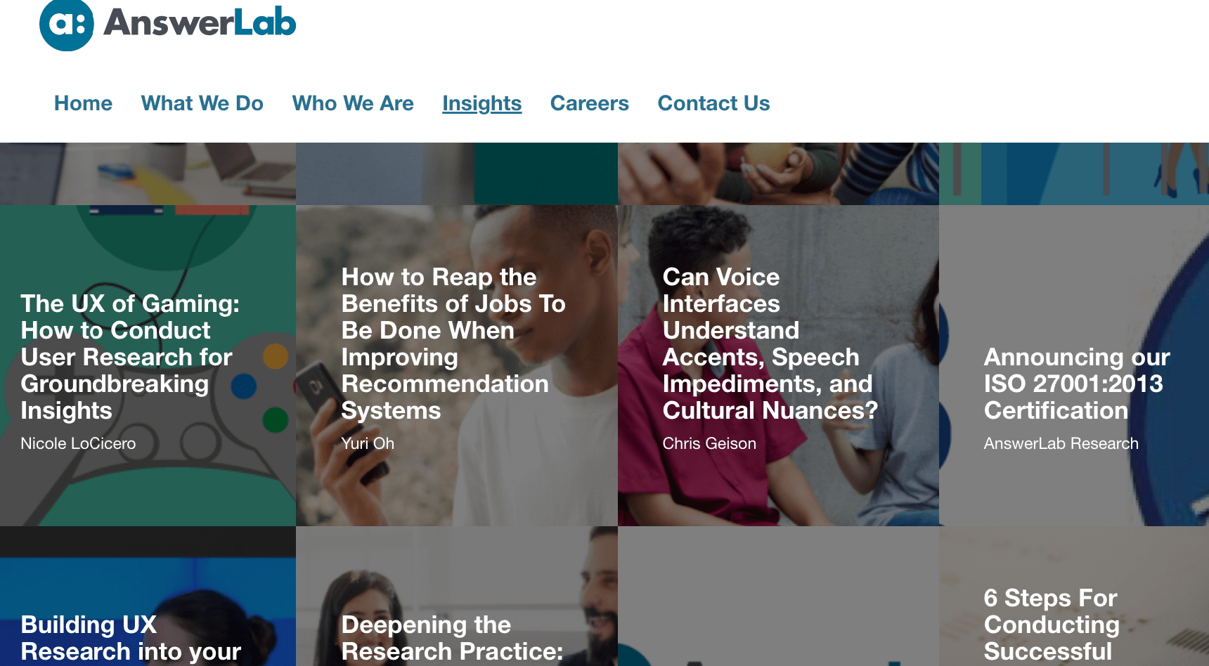
The highlight of the Answer Lab website is the blog. The articles are numerous of decent quality. I checked, and Answer Lab does not get enough hits to rank in the statistical measurement application I use. Unlike the blog articles on many UX company’s websites, these articles did not appear to have been written by forcing people to write on topics that did not interest them or were just explicitly designed to get traffic.
These quotes from one article are illustrative of what the blog articles are like.
Per Jakob Nielsen’s “First Rule of Usability,” researchers should train themselves not only to listen but also to observe, as participants do not always say what they want or understand what they need. We’ve all experienced a participant saying one thing and doing the opposite. Often, their reasoning behind an action isn’t clear until you ask them the 5 whys, a technique used to explore the causality underlying a particular problem. When working with stakeholders to ascertain detailed research goals, you can use similar techniques to understand the “why” behind a study.
And this one.
Exploratory research helps you understand what your users need, how your products could fit into their daily lives, what kinds of products and solutions are already working for them, and where there are gaps in their daily experience. We like diving into the context of user interactions with ethnographic research in a user’s home or work setting. Unlike usability tests and other qualitative research methods, ethnographic research often focuses on allowing users to dictate the flow and pace of the session to capture and understand real world experiences. Seeing users in their own environments gives you invaluable insights into their daily experience.
And this one.
Before you commit development time to building out a fully fledged prototype, try concept testing. You can test screenshots, sketches, storyboards, video walkthroughs, or even plain old ideas to get user feedback on the concepts themselves before you take yourself too far down the path of designing a prototype. What if your idea is confusing to users, but you don’t get feedback until you’ve already designed a prototype? Chances are that prototype won’t meet user needs, and you’ll have spent time and effort only to discover you’re usability testing the wrong thing.
Conclusion
The Answer Lab website is quite good. Compared to other UX company’s websites, it is plain. But like Jakob Nielsen’s website, a plain website has a tendency to grow on the reader, rather than being overwhelming and focused on making the website pretty or having strange and eye-catching design elements. The content on the site is well written, and the only thing holding back a higher score is the blog content is ok, but not good enough to push the overall site score to a 10.
Overall, we rate the Answer Lab website an 8.7 out of 10.
